Introduction
Additional information about this documentation:
Markdown Features
Docusaurus supports Markdown and a few additional features.
Front Matter
Markdown documents have metadata at the top called Front Matter:
---
id: my-doc-id
title: My document title
description: My document description
slug: /my-custom-url
---

## Markdown heading

Markdown text with [links](./hello.md)
Links
Regular Markdown links are supported, using url paths or relative file paths.
Let's see how to [Create a page](/create-a-page).
Let's see how to [Create a page](./create-a-page.md).
Result: Let's see how to Create a page.
Images
Regular Markdown images are supported.
You can use absolute paths to reference images in the static directory (static/img/docusaurus.png):


You can reference images relative to the current file as well. This is particularly useful to colocate images close to the Markdown files using them:

Code Blocks
Markdown code blocks are supported with Syntax highlighting.
```jsx title="src/components/HelloDocusaurus.js"
function HelloDocusaurus() {
  return <h1>Hello, Docusaurus!</h1>;
}
```
function HelloDocusaurus() {
  return <h1>Hello, Docusaurus!</h1>;
}
Admonitions
Docusaurus has a special syntax to create admonitions and callouts:
:::tip[My tip]

Use this awesome feature option

:::

:::danger[Take care]

This action is dangerous

:::
Use this awesome feature option
This action is dangerous
MDX and React Components
MDX can make your documentation more interactive and allows using any React components inside Markdown:
export const Highlight = ({children, color}) => (
  <span
    style={{
      backgroundColor: color,
      borderRadius: '20px',
      color: '#fff',
      padding: '10px',
      cursor: 'pointer',
    }}
    onClick={() => {
      alert(`You clicked the color ${color} with label ${children}`)
    }}>
    {children}
  </span>
);

This is <Highlight color="#25c2a0">Docusaurus green</Highlight> !

This is <Highlight color="#1877F2">Facebook blue</Highlight> !
This is Docusaurus green !
This is Facebook blue !
Manage Docs Versions
Docusaurus can manage multiple versions of your docs.
Create a docs version
Release a version 1.0 of your project:
npm run docusaurus docs:version 1.0
The docs folder is copied into versioned_docs/version-1.0 and versions.json is created.
Your docs now have 2 versions:
1.0athttp://localhost:3000/docs/for the version 1.0 docscurrentathttp://localhost:3000/docs/next/for the upcoming, unreleased docs
Add a Version Dropdown
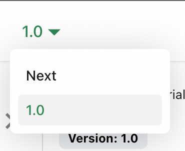
To navigate seamlessly across versions, add a version dropdown.
Modify the docusaurus.config.js file:
export default {
  themeConfig: {
    navbar: {
      items: [
        {
          type: 'docsVersionDropdown',
        },
      ],
    },
  },
};
The docs version dropdown appears in your navbar:
Update an existing version
It is possible to edit versioned docs in their respective folder:
versioned_docs/version-1.0/hello.mdupdateshttp://localhost:3000/docs/hellodocs/hello.mdupdateshttp://localhost:3000/docs/next/hello
Translate your site
Let's translate docs/intro.md to French.
Configure i18n
Modify docusaurus.config.js to add support for the fr locale:
export default {
  i18n: {
    defaultLocale: 'en',
    locales: ['en', 'fr'],
  },
};
Translate a doc
Copy the docs/intro.md file to the i18n/fr folder:
mkdir -p i18n/fr/docusaurus-plugin-content-docs/current/

cp docs/intro.md i18n/fr/docusaurus-plugin-content-docs/current/intro.md
Translate i18n/fr/docusaurus-plugin-content-docs/current/intro.md in French.
Start your localized site
Start your site on the French locale:
npm run start -- --locale fr
Your localized site is accessible at http://localhost:3000/fr/ and the Getting Started page is translated.
In development, you can only use one locale at a time.
Add a Locale Dropdown
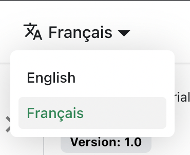
To navigate seamlessly across languages, add a locale dropdown.
Modify the docusaurus.config.js file:
export default {
  themeConfig: {
    navbar: {
      items: [
        {
          type: 'localeDropdown',
        },
      ],
    },
  },
};
The locale dropdown now appears in your navbar:
Build your localized site
Build your site for a specific locale:
npm run build -- --locale fr
Or build your site to include all the locales at once:
npm run build